The same fabric can look flattering in one light and dull in another — not because it changed, but because what reaches your eye is never just the fabric alone. At a basic level, the light arriving at your eye depends on both the surface and the light source. A compact way to say it: reflected light = surface reflectance × illumination. If the illumination changes, the signal reaching your eye changes too.
People generally retain color constancy for familiar objects — a school bus still looks yellow across changing conditions. But that constancy is imperfect, especially for subtle judgments. It does not fully cancel differences caused by the quality or intensity of light.
That "imperfect" part is exactly where personal color analysis lives. You don't need perfect color constancy to recognize a tomato as red. But deciding whether a dusty rose blouse harmonizes with someone's skin better than a coral blouse is a much finer judgment. Small shifts in lighting can alter the apparent hue, value, or chroma enough to change the impression entirely.
The fitting room problem
Take a classic example. Imagine a berry-colored knit top under warm indoor lighting — the kind of yellowish light common in many stores. Warm lighting adds a golden cast to everything in the room. It may make the top appear richer, warmer, and more forgiving against skin.
Step outside into cool daylight, and the same fabric may lose that cozy glow. It might read flatter, bluer, or harsher depending on the person's coloring. The garment did not become a different object. The viewing conditions changed.
This is not a minor effect. If you judge a color only under one biased light source, you may mistake a lighting effect for a true harmony effect. What felt like a great match in the store was partly the store doing the work.
Simultaneous contrast: what's around you changes what you see
Lighting is only half the story. The other half is context — what colors sit around the fabric.
This is the principle of simultaneous contrast: neighboring colors shift perceived hue, value, and chroma. A color can look different just because its surroundings changed.
A classic lightness example: take an identical neutral gray swatch. Place it on a white background and it looks darker. Place it on a black background and it looks lighter. Nothing about the swatch changed — your perception shifted relative to the surround.
Hue works the same way. Place a muted grayish beige next to warm orange-brown wood paneling and it may look cooler or slightly greenish by comparison. Put the same beige beside a cool bluish-gray wall and it may look warmer. The surround nudges perception in the opposite direction.
This matters more than it first seems. A fabric is almost never viewed in isolation. In real life it sits next to skin, hair, makeup, jewelry, a wall, a mirror frame. If a scarf is tested near a warm tan coat, it may appear cooler than when tested against a white T-shirt. If lipstick is swatched under ring-light illumination against a pink bathroom wall, the impression can differ significantly from what you see near a window on a neutral background.
A worked example
Suppose a top is a medium, muted teal. Against a creamy beige changing-room wall under warm bulbs, the wall pushes the teal cooler by contrast while the warm light slightly softens everything. The result may feel balanced and elegant.
Now photograph the same top in open shade against a cool gray concrete wall. The cooler environment may make the top seem flatter and less lively against skin — especially if the person's own coloring is already cool and low-contrast. Someone might say, "this top changed." More accurately, the appearance relationship changed.
The adaptation layer — why you stop noticing the cast
There is also a human adaptation layer that makes this harder to detect in the moment.
Your visual system is always adjusting to the scene. This supports color constancy — your brain's ability to keep perceived colors stable across changing conditions. That adaptation is useful, but it can also hide the cast of a room from you while you're standing in it.
After a few minutes under warm lighting, the room starts to feel "normal." A photo taken elsewhere, or a side-by-side comparison under neutral light, suddenly reveals that what seemed balanced was actually quite yellow. This is one reason experts prefer controlled draping conditions and repeated comparisons instead of single glances under ambient lighting.
What this means for color analysis — and why method matters
These effects — lighting color temperature, simultaneous contrast, and visual adaptation — are not minor nuisances. They explain why casual color analysis so often produces unreliable results, and why controlling for them produces significantly better ones.
A selfie taken under warm indoor lighting will make your skin appear warmer than it is. A photo in a room with a cool-toned wall will make your skin appear cooler. A single glance in a changing room, under a biased light source, surrounded by the colors of that room, is one of the worst possible ways to judge color harmony. Yet that's exactly how most people make decisions.
For any color judgment to be reliable:
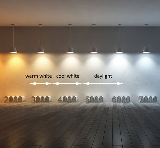
- Lighting must be neutral and consistent — ideally north-facing daylight or a calibrated daylight-balanced source. Warm bulbs shift everything orange. Fluorescent lighting shifts everything green. Both distort color measurements.
- The background must be neutral — a strongly colored wall changes the apparent color of everything near it through simultaneous contrast
- Comparison must be direct — two colors evaluated side by side under the same conditions is far more reliable than evaluating one color alone, or evaluating both in different settings
- Observations should be repeated — a single glance tells you less than a sustained comparison, because adaptation takes time and varies by person
This is why professional color analysis uses controlled draping conditions — not because analysts are being precious, but because the perceptual effects are large enough to change the result.
It's also why the instructions for photo upload matter. Natural daylight, neutral background, no filters: each of these removes a specific source of measurement error. The science behind those instructions is real. A better photo produces a better result because there's less noise between your actual coloring and what the analysis can measure.
Perceived color is relational, not absolute. What you experience is shaped by the light source, the surround, and your visual adaptation — not just the fabric or the face. Understanding that is the difference between color analysis that produces consistent results and color analysis that doesn't.